Chart of the day
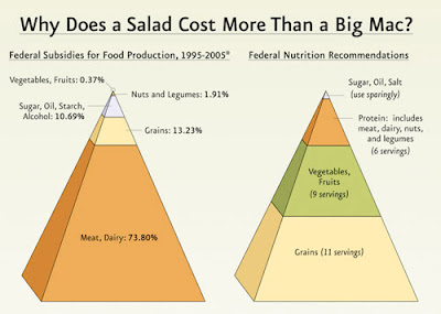
This chart helps to explain why a Big Mac is cheaper than a salad: look how the federal government allocates agricultural subsidies compared to recommendations for a healthy diet. Ridiculous.
Labels: economy, health, U.S. politics
posted by michael at 6:23 PM
![]()
![]()

 Subscribe to this RSS feed


0 Comments:
Post a Comment
<< Home