Tax plan comparisons
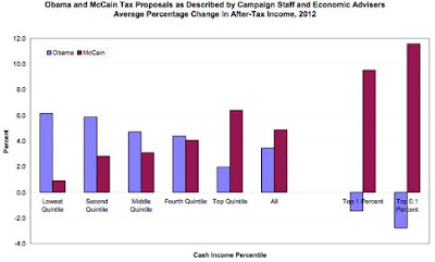
Obama's plan would result in higher after tax income for everyone but the top 1% of tax payers, and his plan would result in higher after tax incomes than McCain's plan for everyone but the top 20% of tax payers.
So estimate which income bracket you fall into and ask yourself, who's going to do more for you... and if you're lucky enough to be in that top 20% bracket, look at the pattern of red bars that represent McCain's plan. Do you really think it's fair that the top 1% of tax payers benefit so disproportionately?
More from Ezra Klein. And interestingly, even McCain's top economic adviser now agrees that Obama's tax plan would result in a net tax reduction over the next ten years.
Here's Obama talking today in Dover, New Hampshire, about taxes, including the fact that McCain's plan has a provision to tax employer healthcare benefits.
Labels: election2008, McCain


0 Comments:
Post a Comment
<< Home